Art Director & Designer
Michael
Sincavage
"Most design in direct response is an afterthought. I made it the weapon."
Scroll
Art Director & Designer
"Most design in direct response is an afterthought. I made it the weapon."
Philosophy
Senior Art Director with 11+ years building visual systems that convert — across fintech, SaaS, and high-growth direct response. I build creative departments, develop campaign languages from scratch, and make work that respects the audience's intelligence while driving measurable results.
After spending the last decade looking at direct response across many industries, one consistent factor is an inclination to under-utilize design. Elevating those visuals — and building trust with the audience through thoughtful art direction — became my defining purpose.
Selected Work
A selection of campaigns, products, and visual systems built under pressure, for audiences that don't suffer bad design. Almost always produced under deadline for bold ideas with zero time for revision.
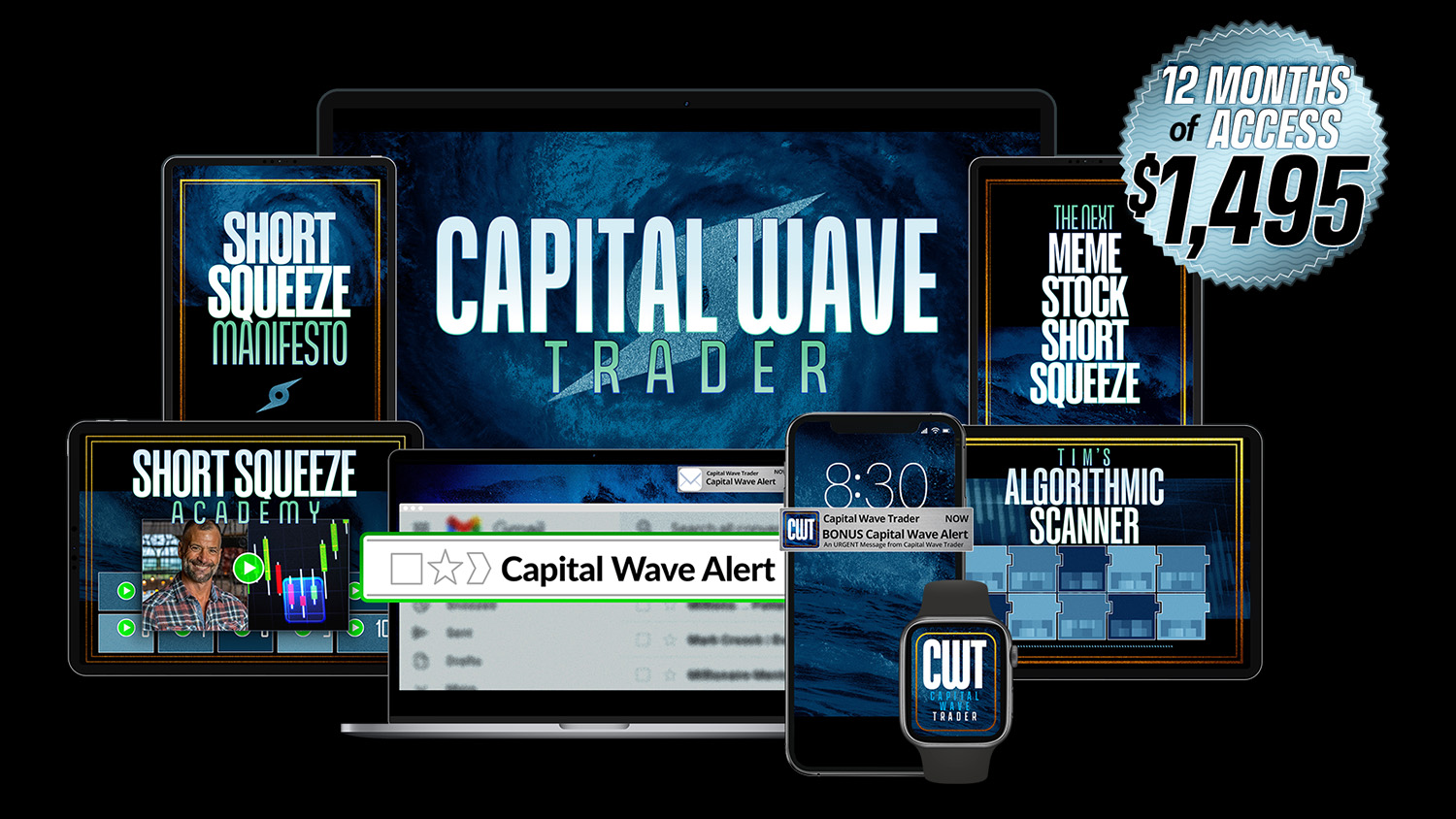
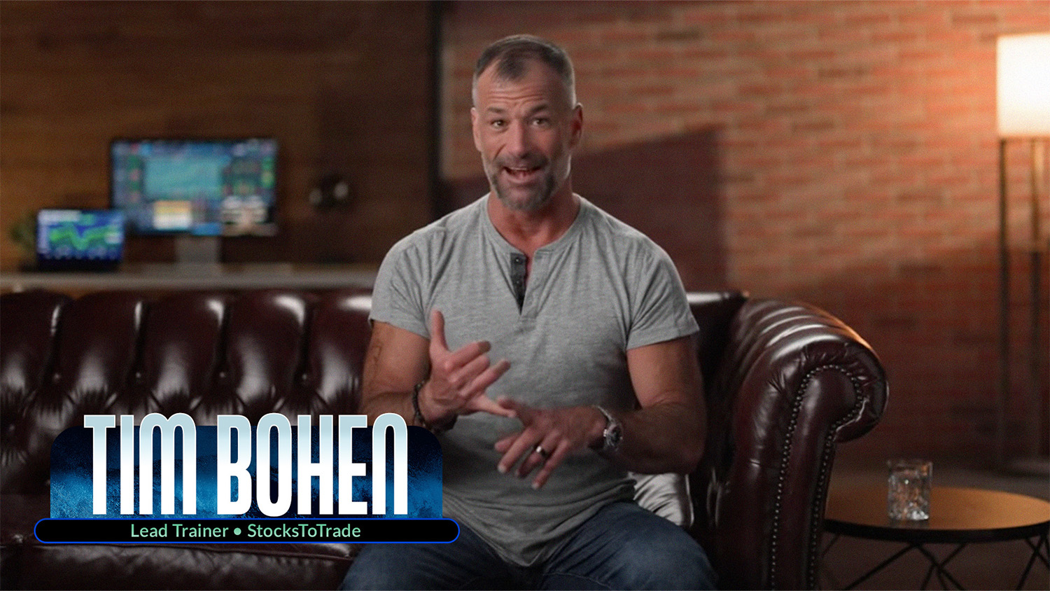
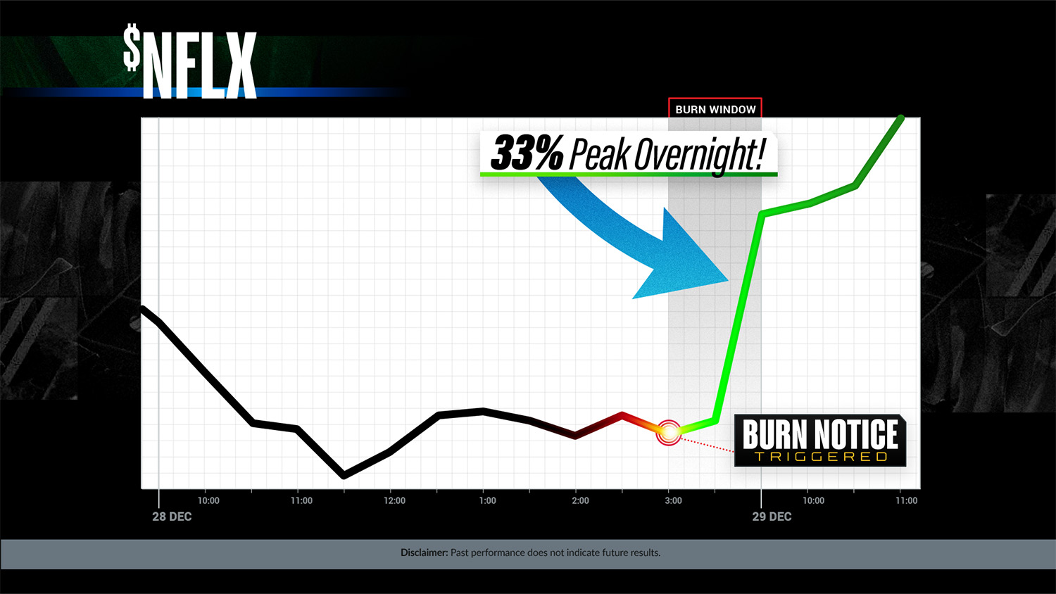
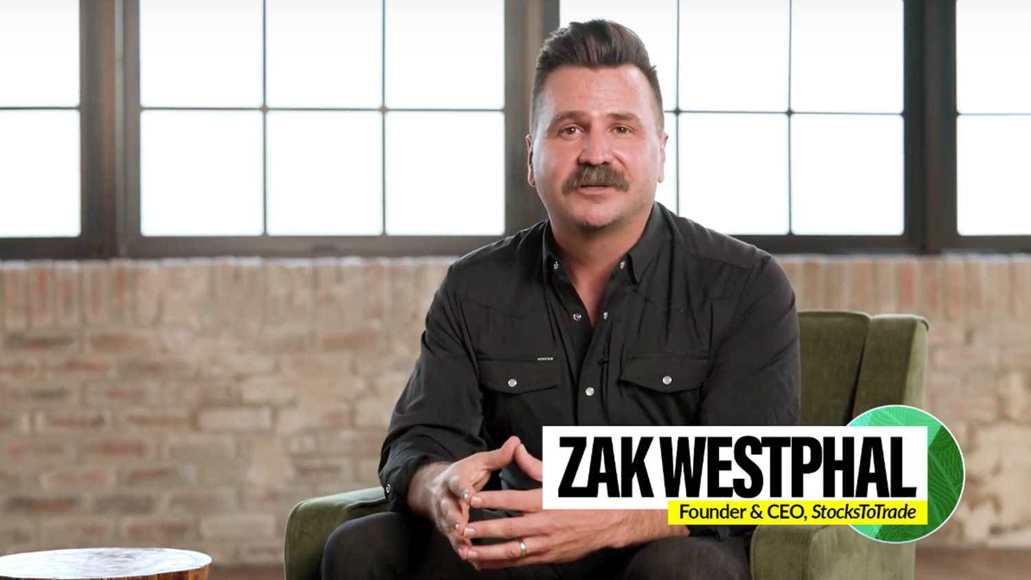
Lead trainer Tim Bohen set out to build a powerful add-on tool to the StocksToTrade platform for traders seeking precision and market insights. I was tasked with creating visuals that would illustrate the bold nature of the trades this tool was built to navigate.
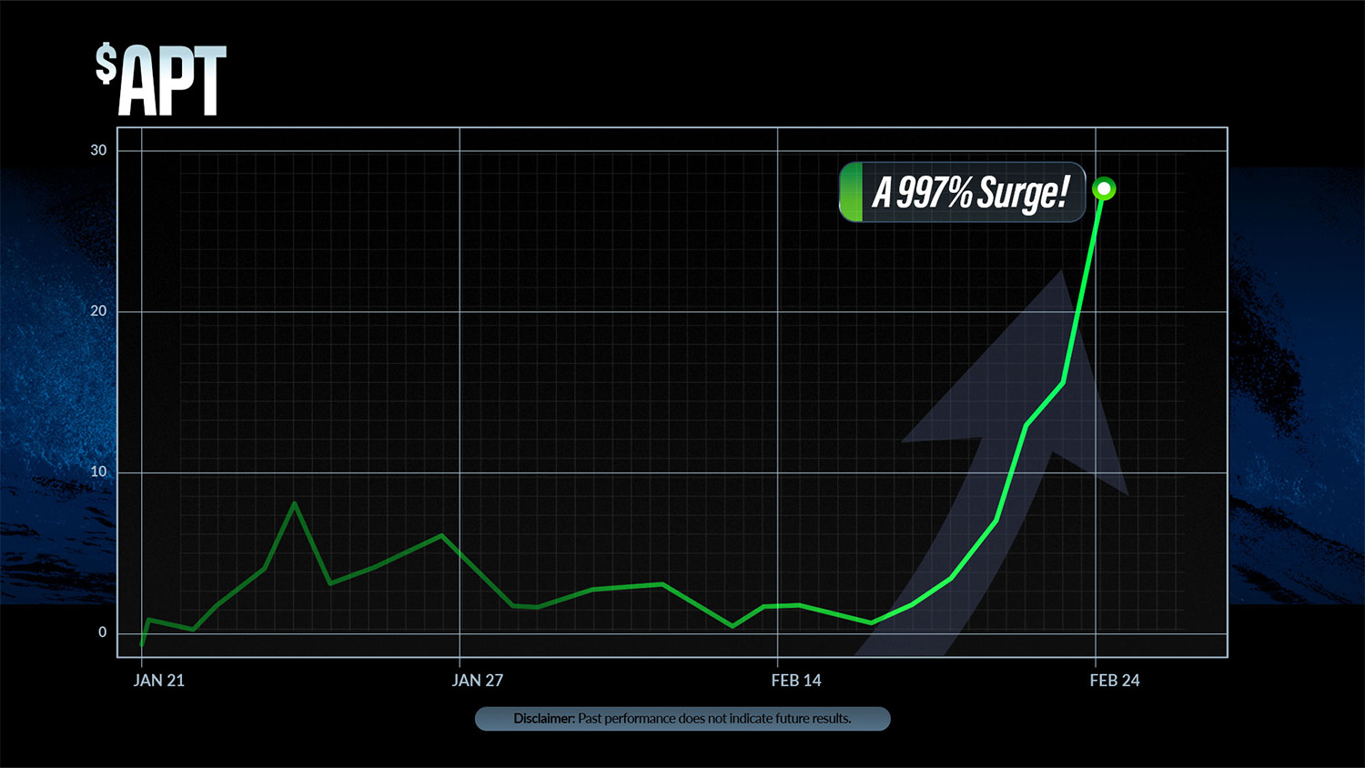
When art directing stock trading products for direct response, my goal has been to trust the intellect of the audience — building visuals that don't get lost in the tropes of finance. The audience knows why they're there; they don't need to be reminded.
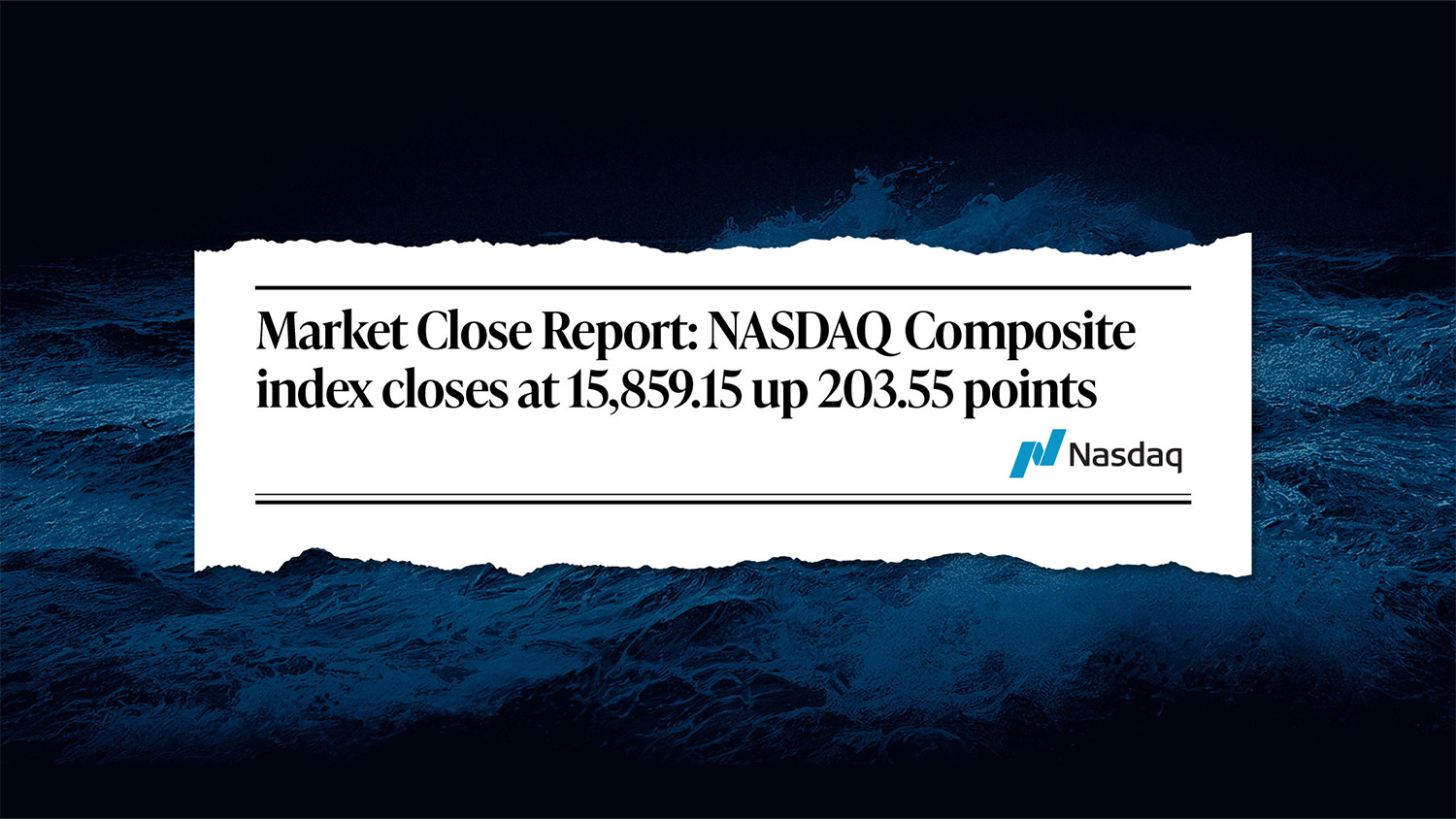
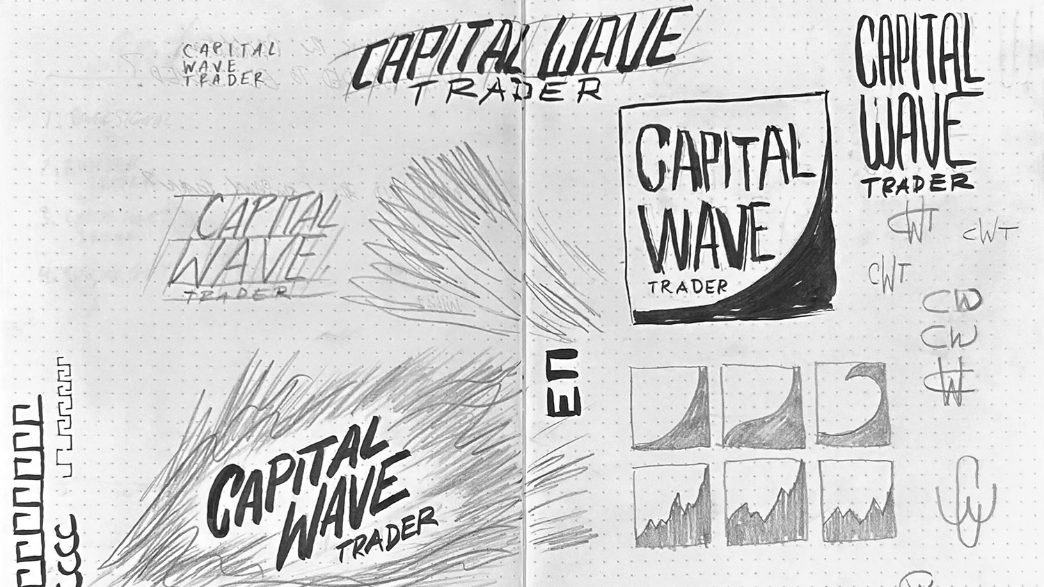
A Capital Wave couldn't be represented by a profit-and-loss line on a black chart. The waves being navigated within the app are wild, crushing, hurricane-force tidal waves. Ultimately, STT chose a confident approach: the product title rendered in bold, clean type set against a dark and stormy cinematic ocean landscape.
The product launched at the end of 2025 and has been steadily on pace to become one of the most essential add-ons within the StocksToTrade platform for advanced traders.
Brand Identity Key Art Direct Response Product Launch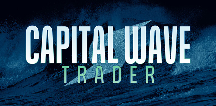
Art Direction & Design — Millionaire Publishing
Direct response marketing is built for one thing: immediate, measurable action. A click, a purchase, a sign-up — not brand awareness. It moves fast, relies on urgency and precision, and lives or dies by its conversion rate.
At its best it's remarkably efficient. At its worst it's junk mail. The difference, more often than not, is design.
After a decade in the space, one pattern was impossible to ignore: direct response consistently underutilizes design. Bad visuals erode trust. My goal at Millionaire Publishing was to fix that — to build art direction that felt developed and lived-in, even when everything was created and deployed in days.
This collection represents my favorite work from those 7.5 years. Almost all of it was produced under deadline, for bold ideas with zero time for revision. That pressure taught me more about creativity, production, and audience psychology than anything else I've done.

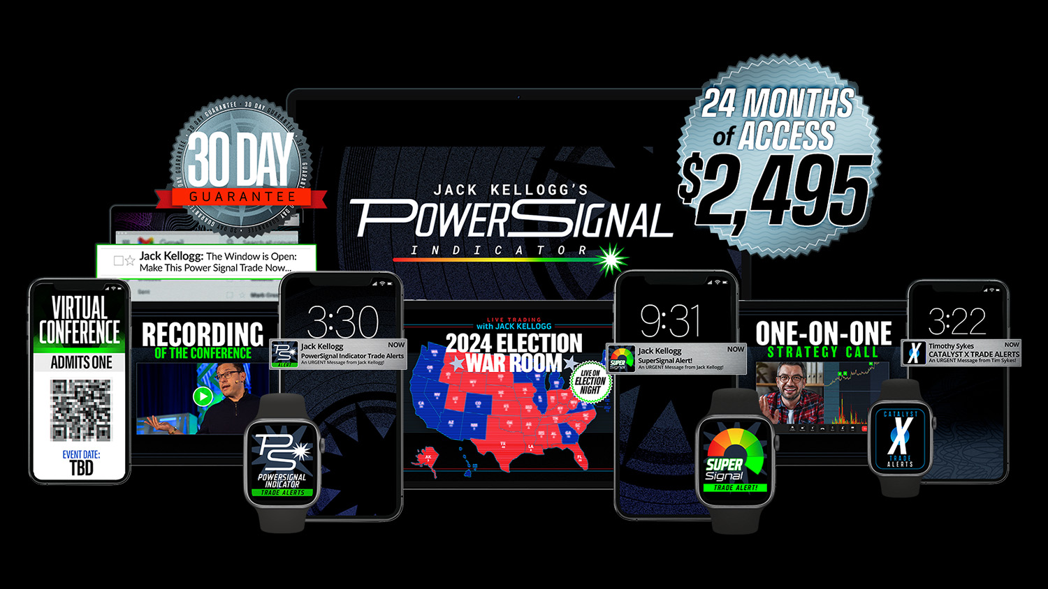
Millionaire Stock Trader Jack Kellogg wanted to create a product that could indicate when a stock was ripe for trading — based on his signature criteria — for his audience of independent stock traders.
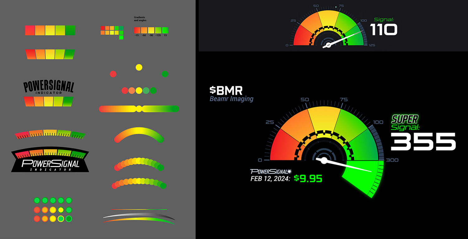
The gauge needed to be more than functional: it also had to showcase when a stock went above and beyond normal parameters. Essentially, it needed to go to 11.
My team explored different gauge formats before landing on a circular design, which then needed to break open and expand to display what became the Super Signal. The design system — gradients, arc forms, color language — was built from scratch to feel both technical and cinematic.
Alongside the gauge, a suite of peripheral products was launched to deepen the user experience and extend the product's value. The Power Signal Indicator launched in 2024 and has since become one of the best-performing products at Millionaire Publishing.
Product Design Brand Identity Design System Direct Response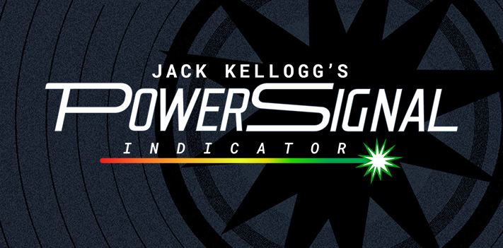

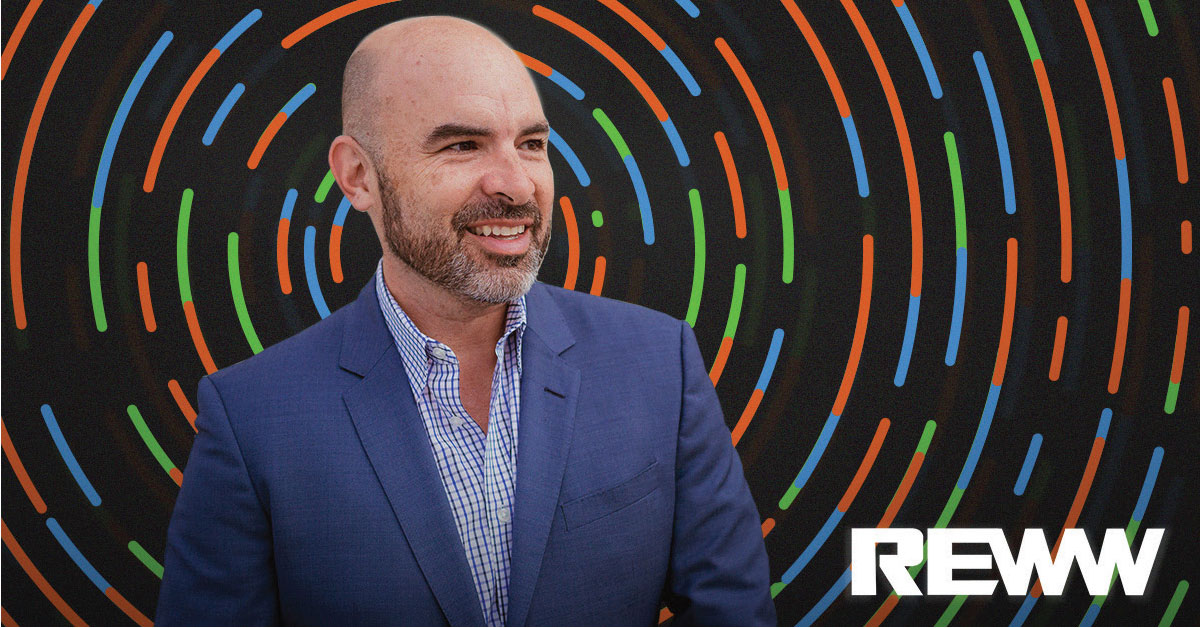
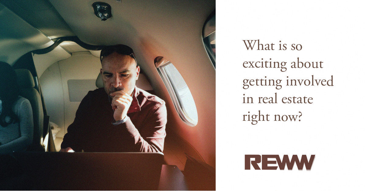
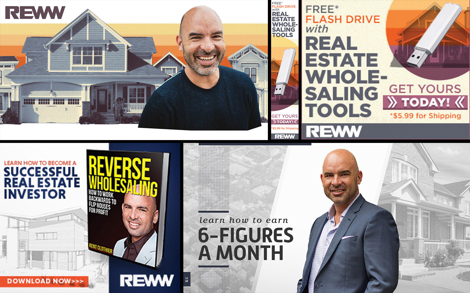
During my time as Art Director at Clicks & Clients, I led the creation of weekly social media ads for Real Estate Worldwide (REWW) — an education and software company serving real estate investors with training programs, lead generation tools, and marketing systems.
REWW brought on Clicks & Clients to build and execute ad campaigns that demanded constant turnaround and sophisticated performance tracking. We developed a methodology we called Performance Creative.
The process began with 5–10 distinct ad concepts per set, run through Facebook and evaluated against a defined set of performance criteria. We structured this as a bracket system — progressively refining the strongest performers until we arrived at the most effective version of each concept.
Top-performing concepts served a dual purpose: they became the benchmark for developing new ads and the foundation for optimizing existing ones. The result was a creative process always grounded in real data. No matter how frequently we generated new work, we were never truly starting from scratch.
Performance Creative Social Ads A/B Testing Facebook Ads

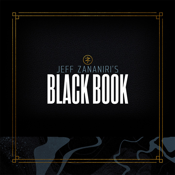
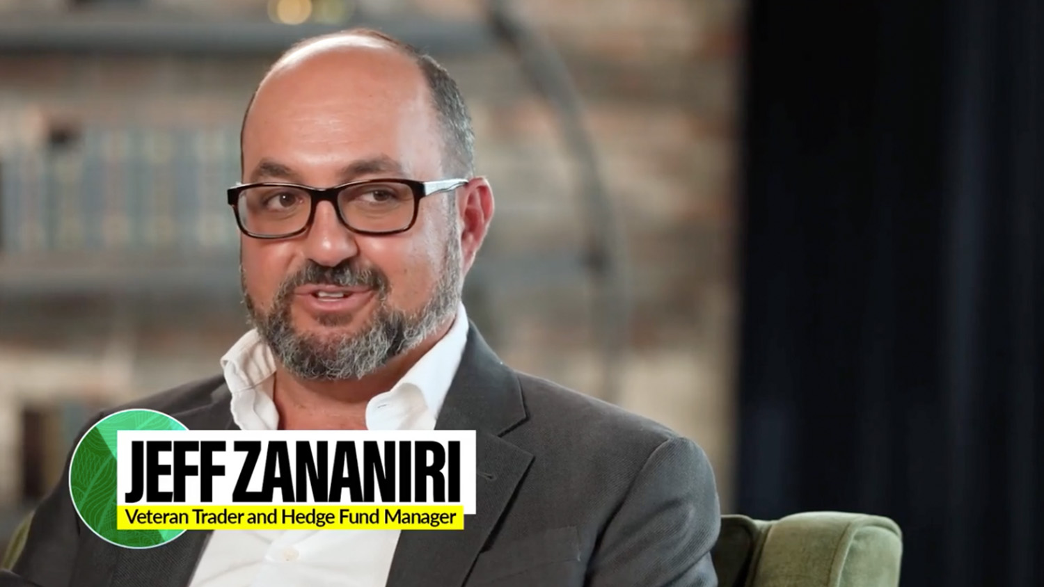
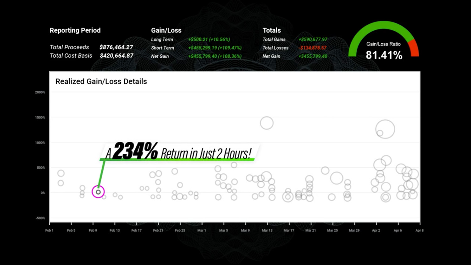
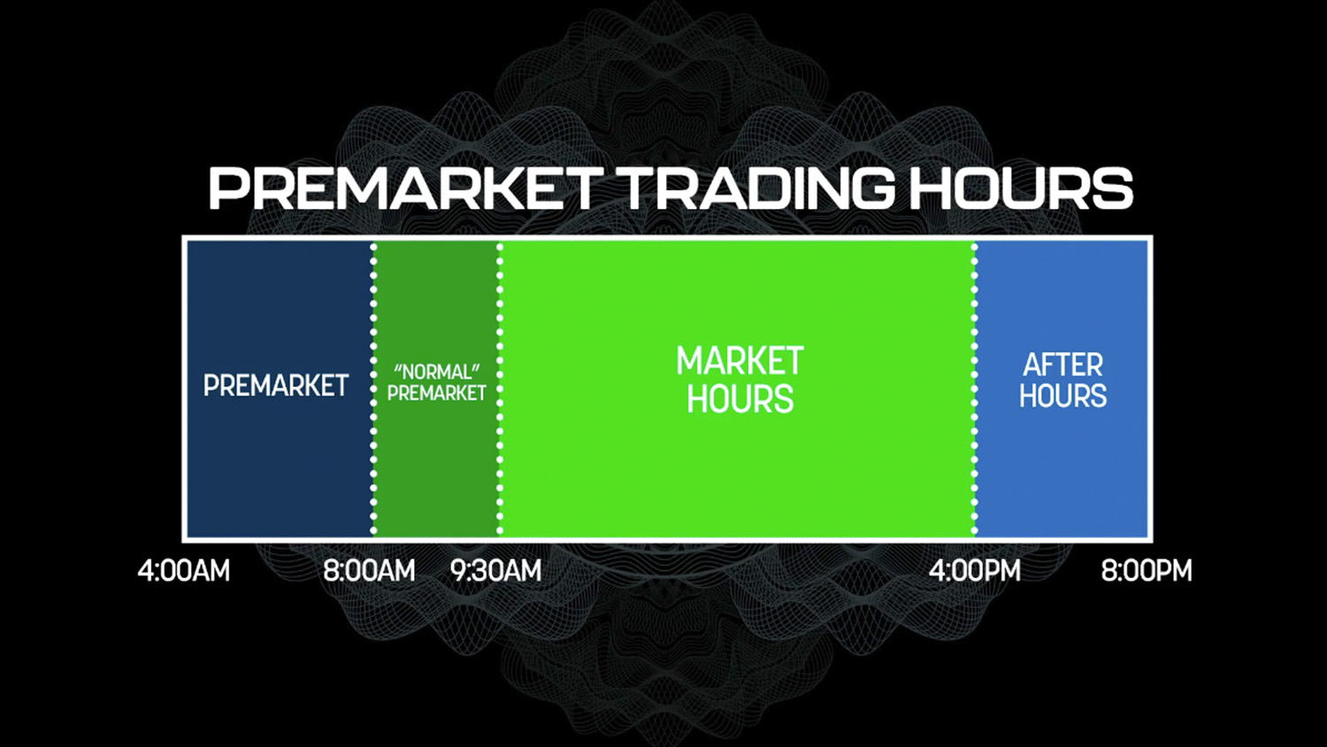
Jeff Zananiri pioneered a technique that turned $5,000 into $500,000 in eight weeks — by riding a specific stock market anomaly triggered by Donald Trump. What should have been a straightforward trading education became a politically charged topic in a venue that had no business being political.
My challenge was keeping the focus on the trading strategy while staying neutral — acknowledging what was driving the anomaly without wading into the politics. That meant steering clear of red, white, and blue, and anything that read as patriotic imagery.
For inspiration, I looked to midcentury print design and opening film credits — bold, graphic, unapologetically stylized. I built a visual direction around luminous reds and greens punched against stark black and white. Color as signal, not sentiment.
The gritty, torn-paper elements rubbing up against clean guilloche patterns felt like exactly the right tension. Something equal parts Ocean's Eleven, classified government document, and editorial photo collage. Clean and dirty. Profit and loss.
The campaign drove the strongest event turnout in Zananiri's history at Millionaire Publishing, generating enough momentum to spin off follow-up events and workshops in the weeks that followed.
Art Direction Event Marketing Collage Direct Response Video Graphics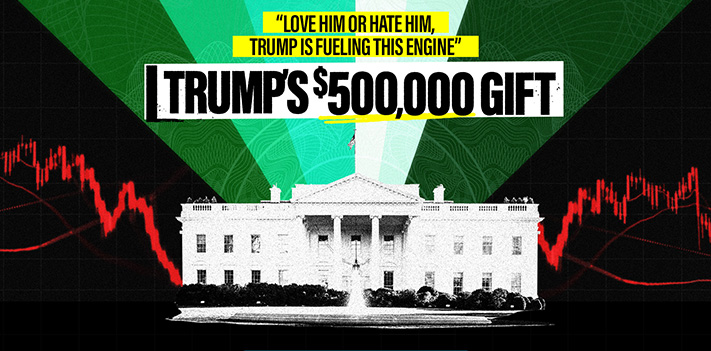

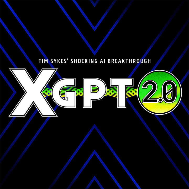
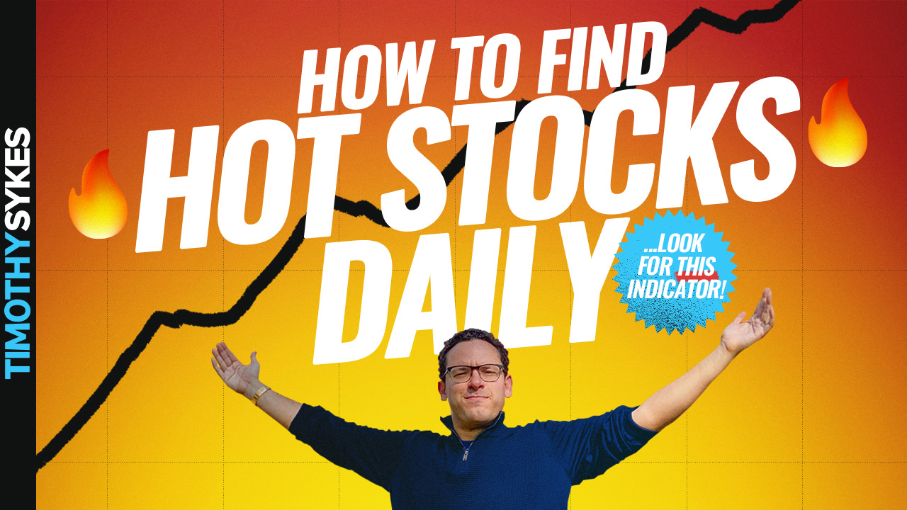
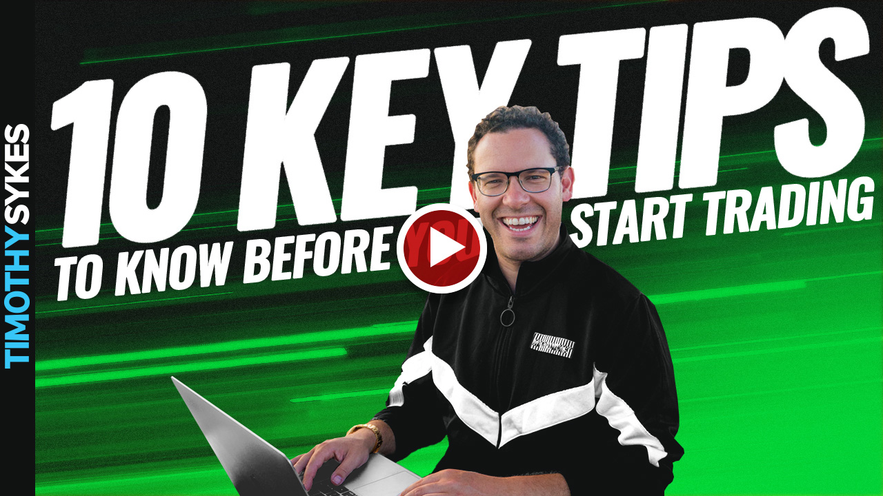
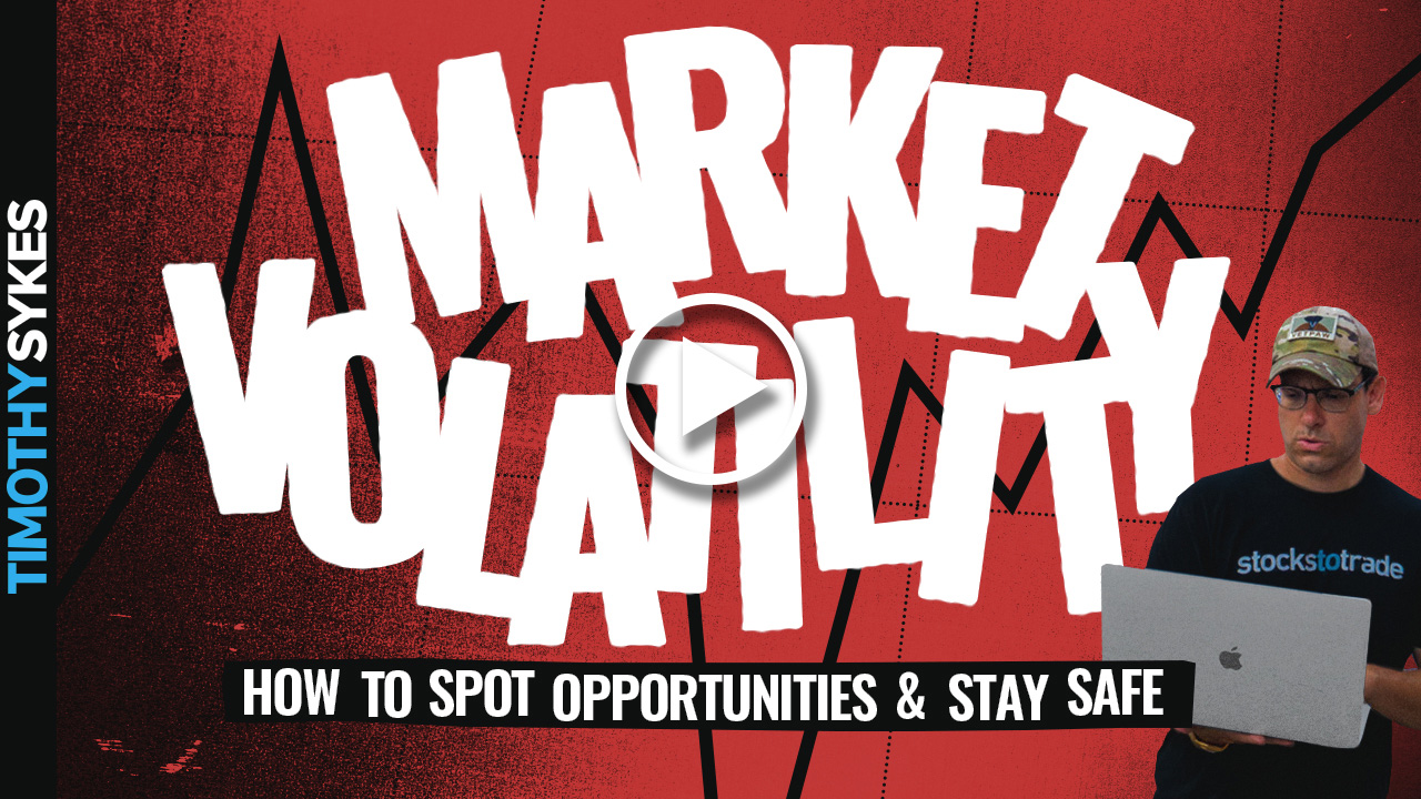
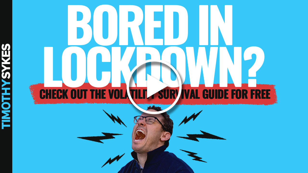
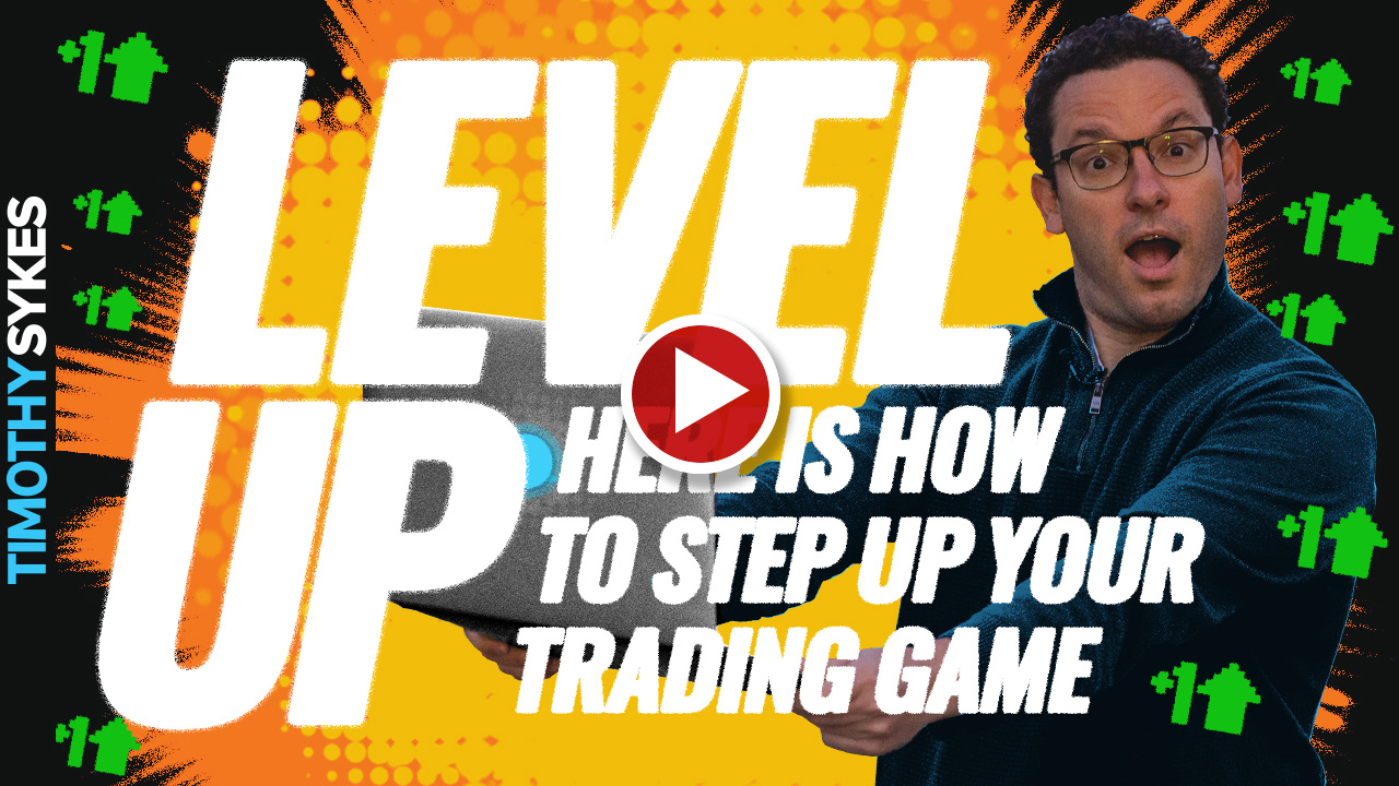
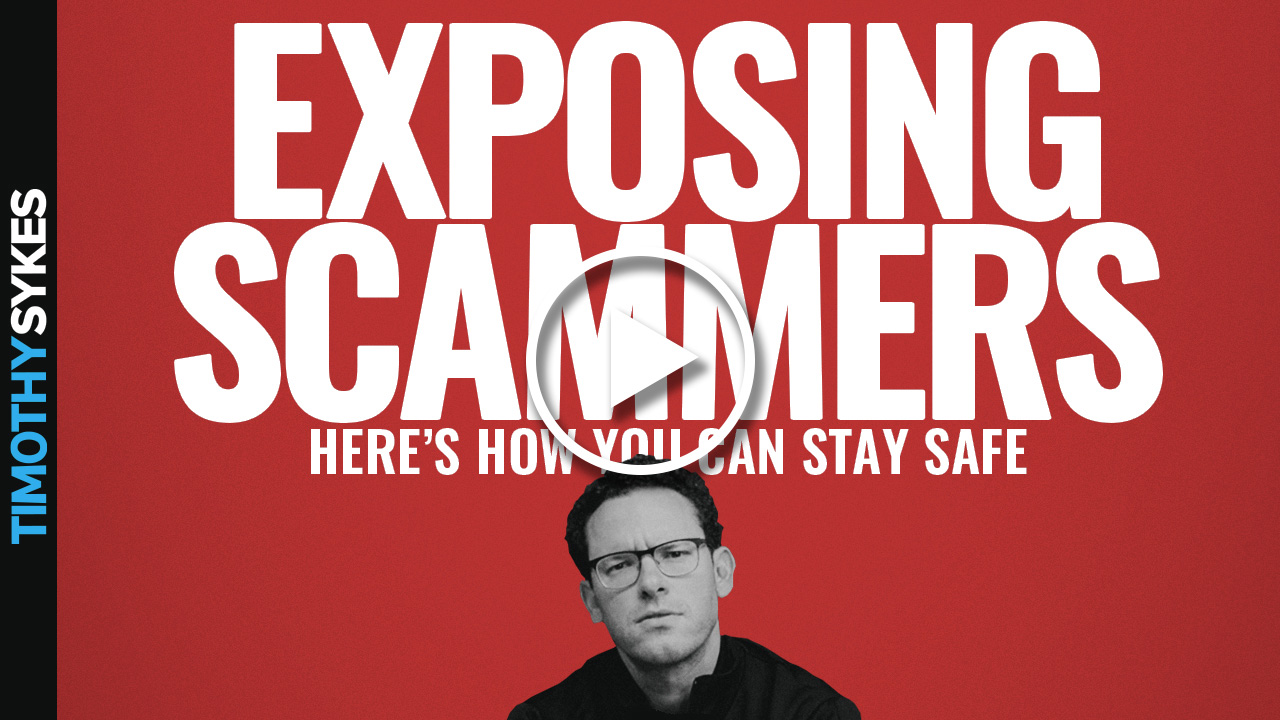
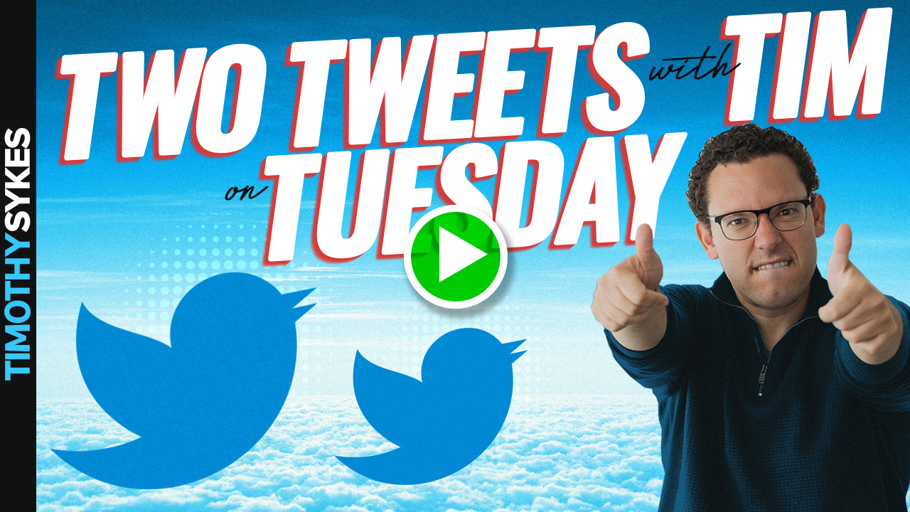
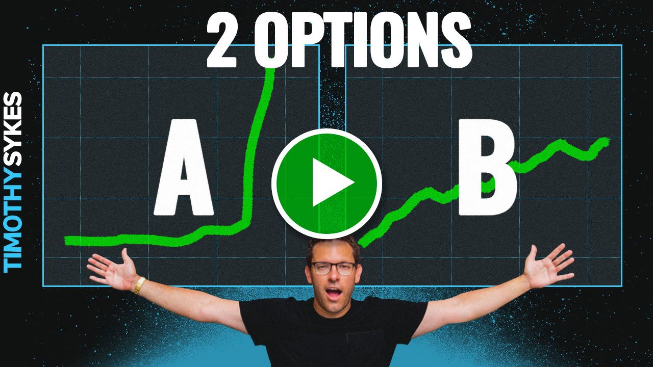
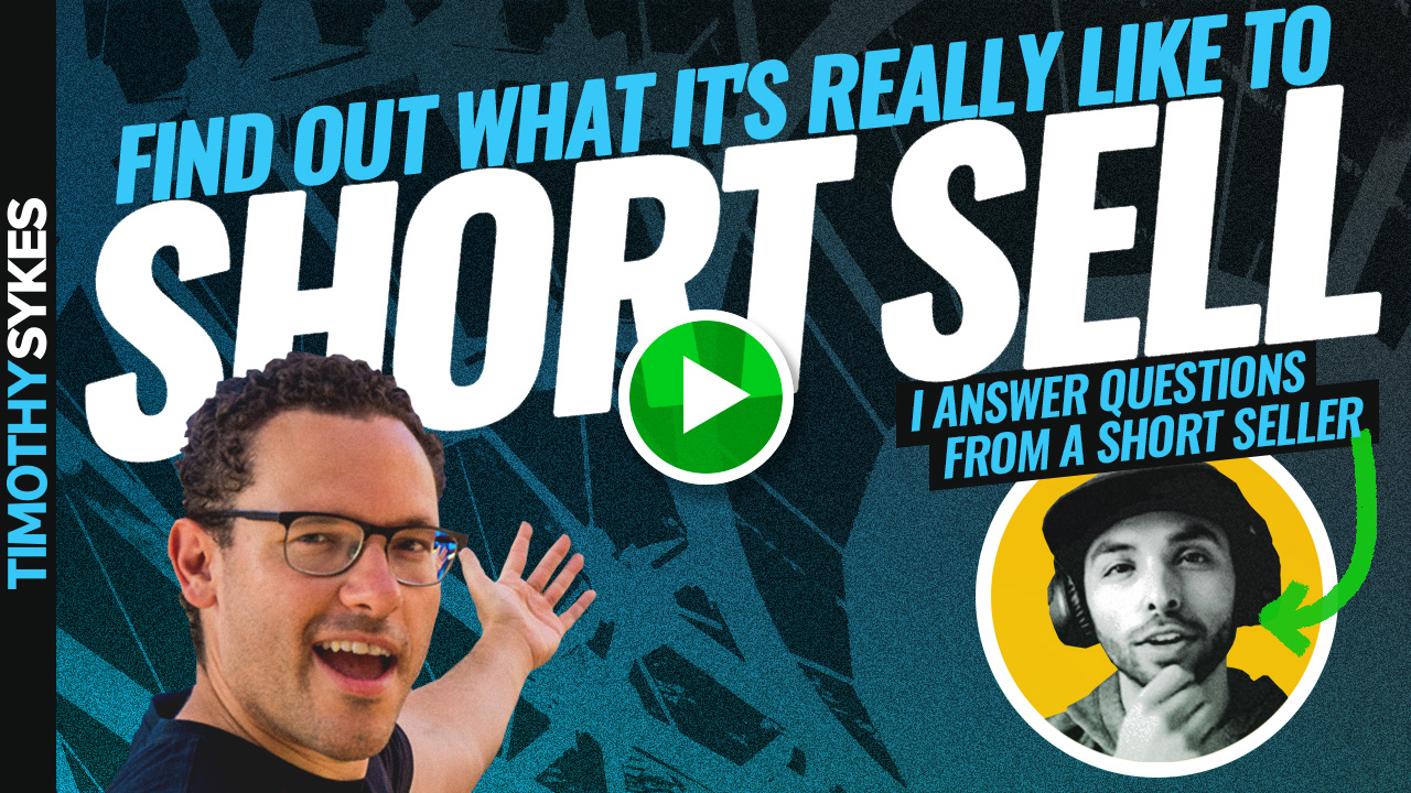
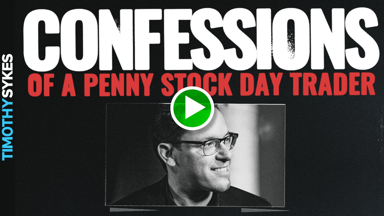
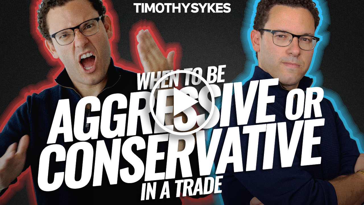
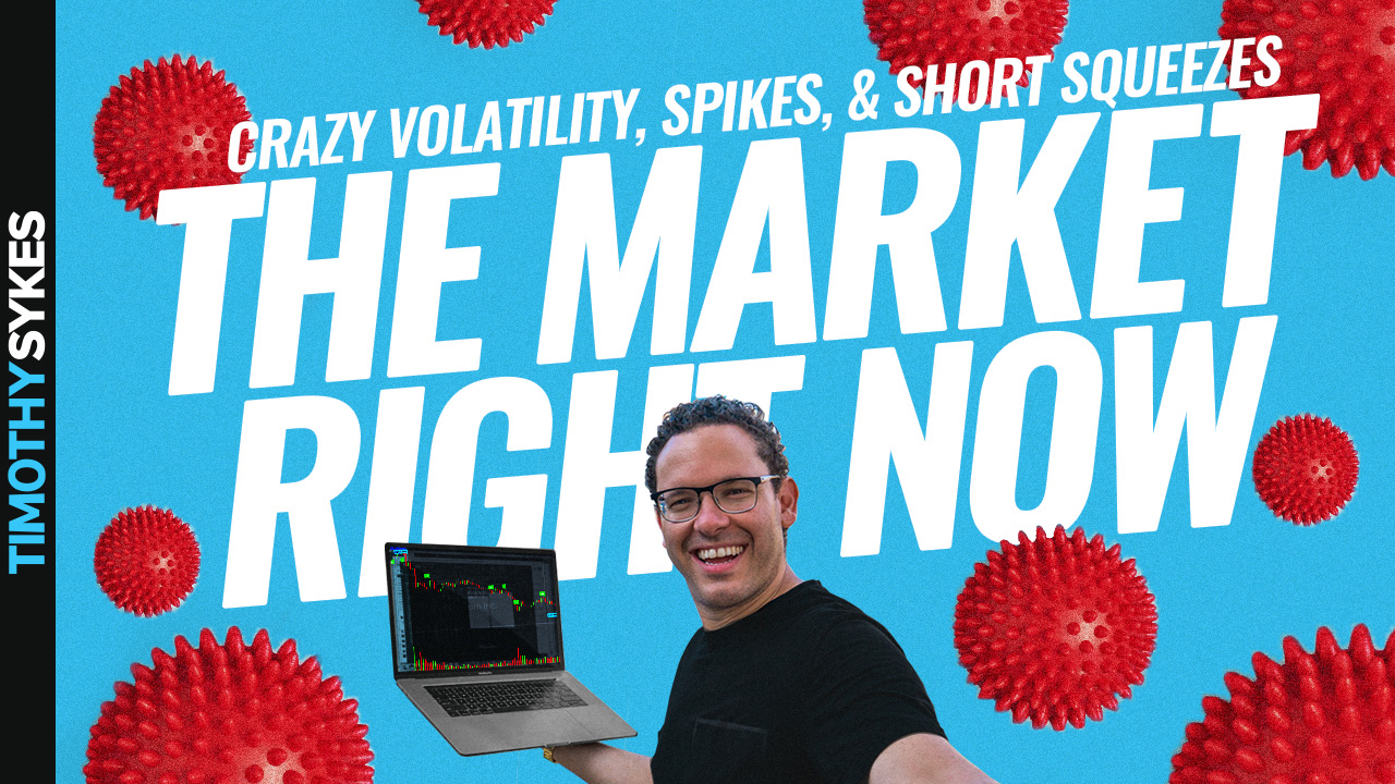
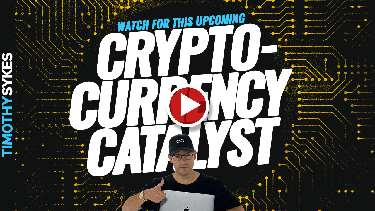
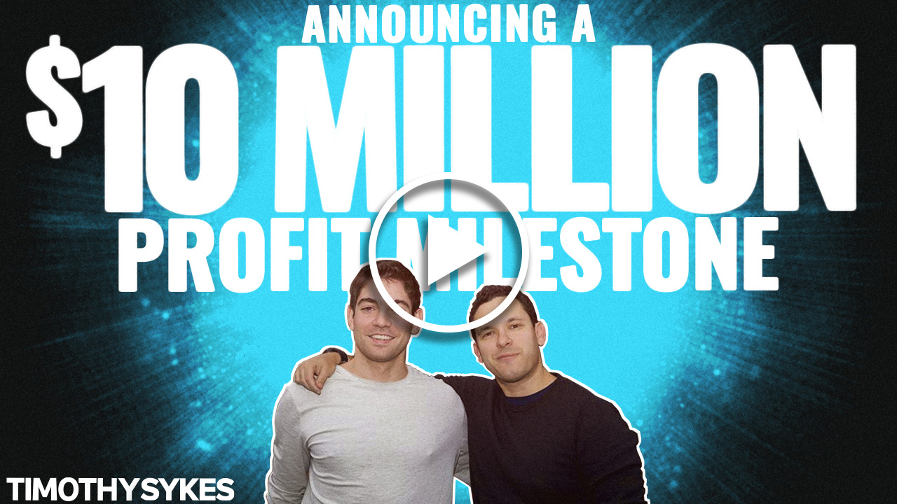
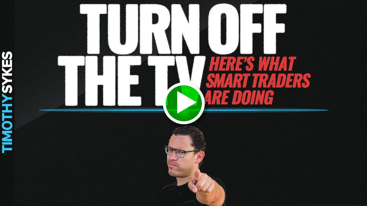
Timothy Sykes is a penny stock trader who turned $12,415 of Bar Mitzvah money into $1.65 million through day trading while still in college. I was responsible for creating his YouTube thumbnails for about three years.
In that time, Sykes went from traveling non-stop with a dedicated videographer to being stuck in Covid lockdown for months. Before Covid, the locations were the focus — Tim in Africa feeding giraffes, trading on a tropical mountaintop in Hawaii, in a lavish hotel room in Japan. Once Covid hit, those locales became out of reach.
The challenge became an opportunity. My solution was to dismiss his location entirely and shift toward something more graphic and dynamic — bold typography, high-contrast design, a visual language built around urgency and clarity rather than backdrop.
The transition proved successful. Views and viewership increased consistently month over month during the lockdown period, helping a new generation of stock traders find their footing during a very unpredictable storm.
YouTube Thumbnail Design Photo Illustration Typography

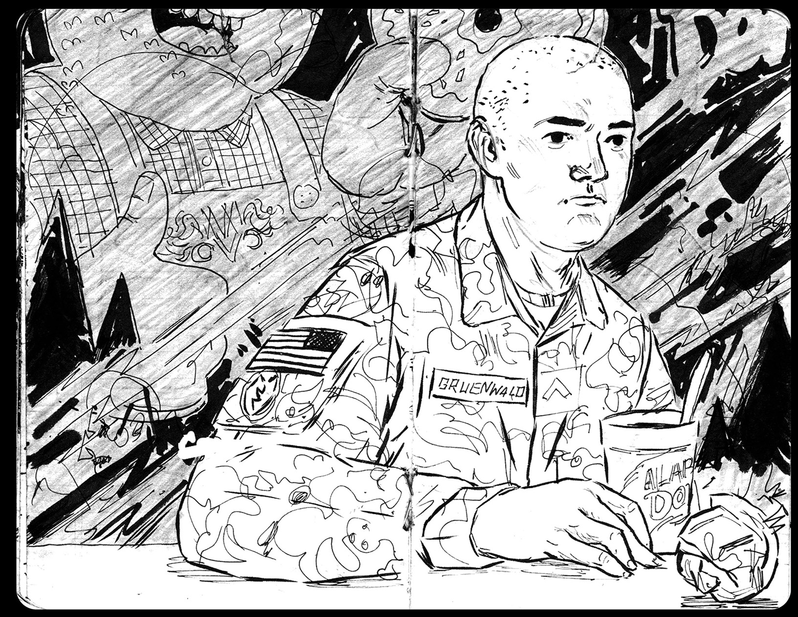
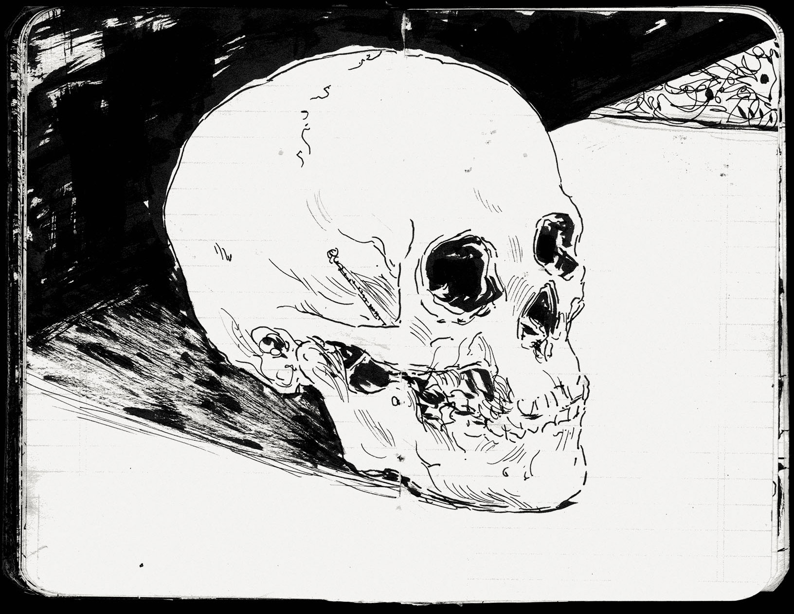
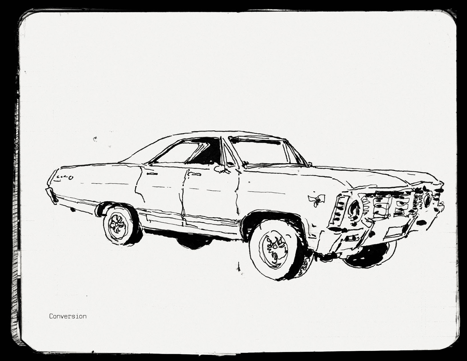
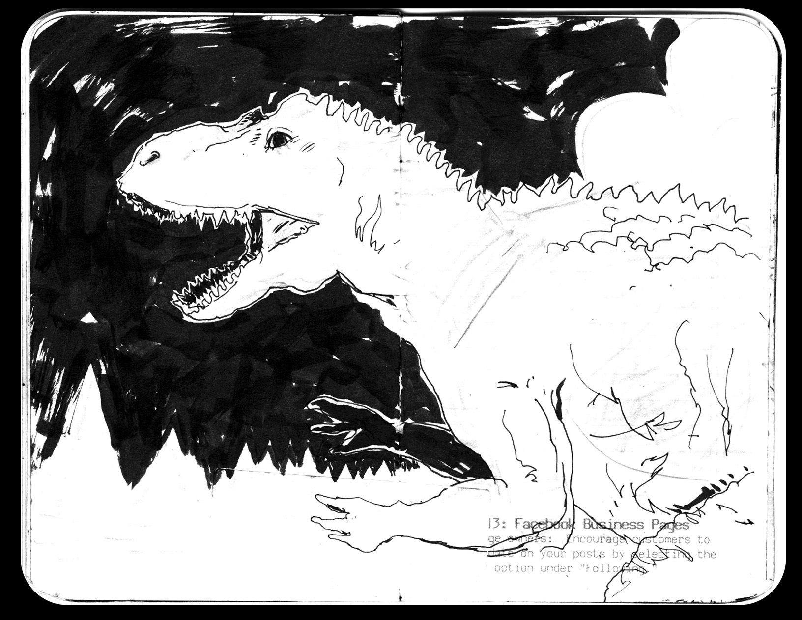
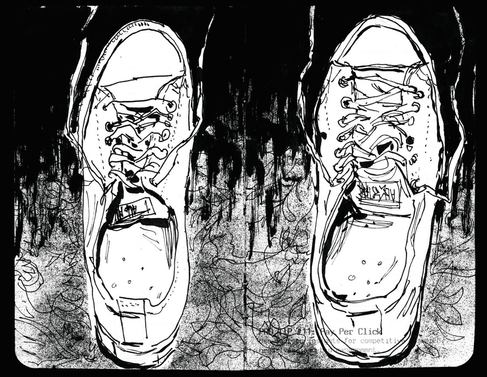
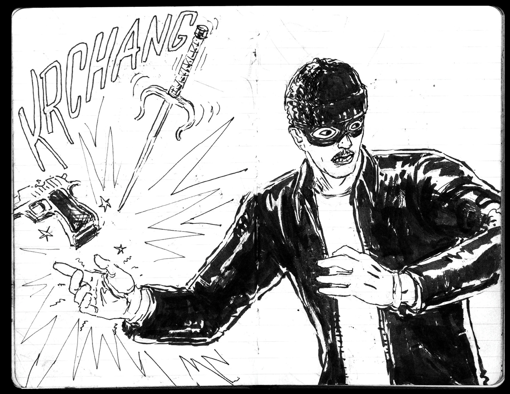
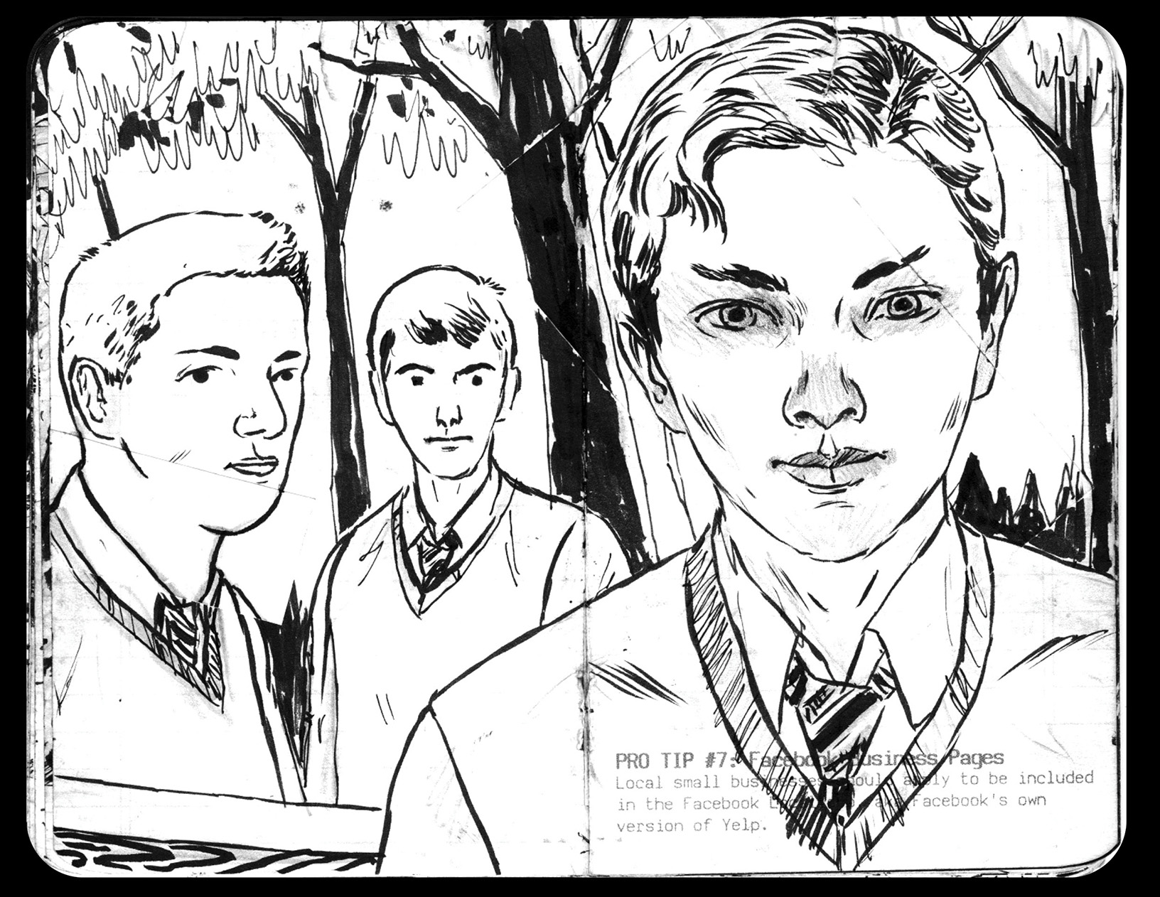
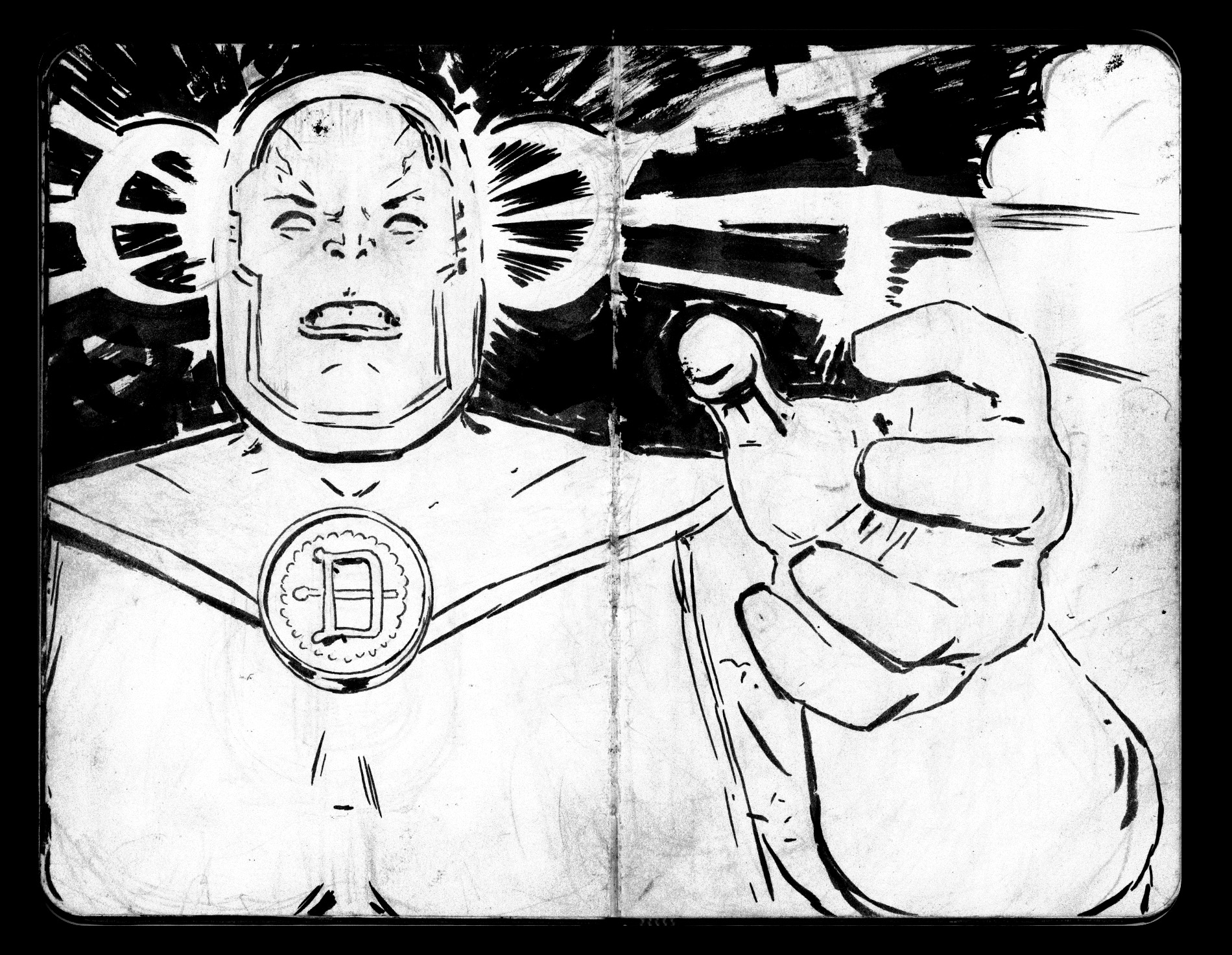
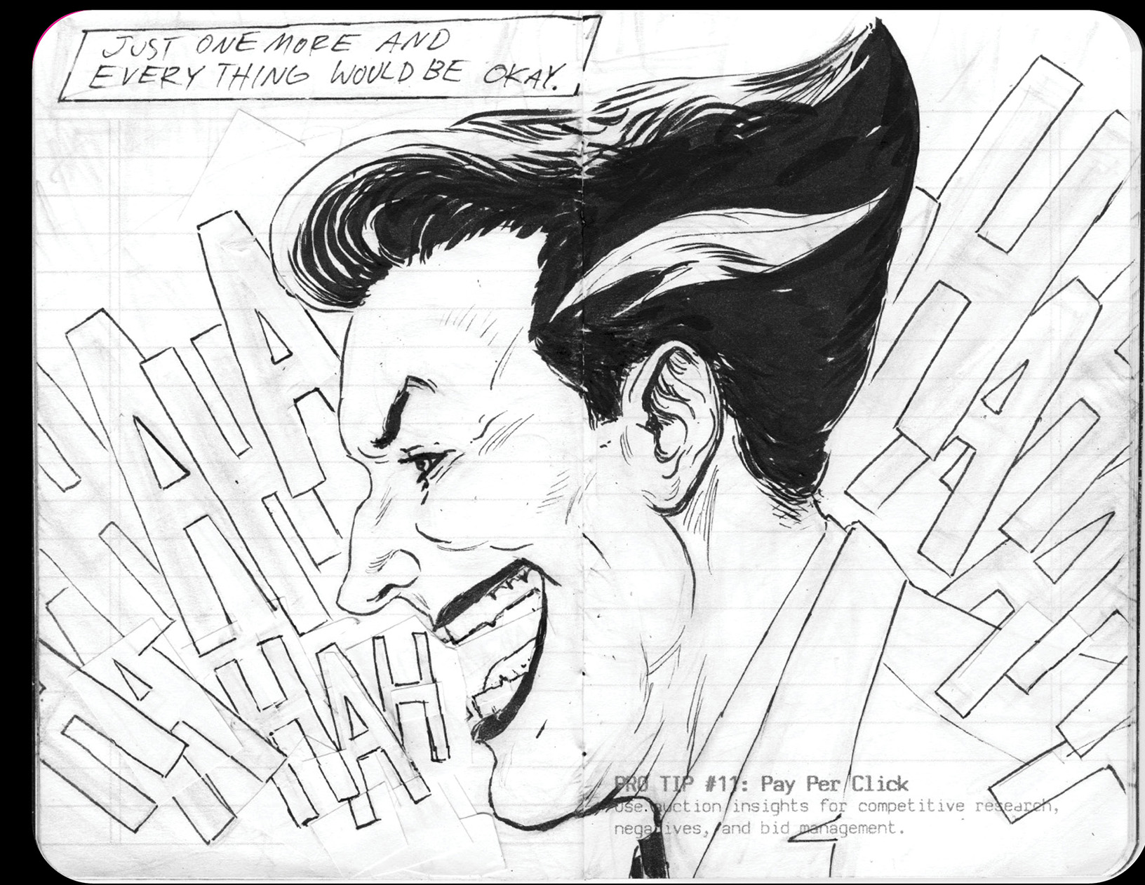
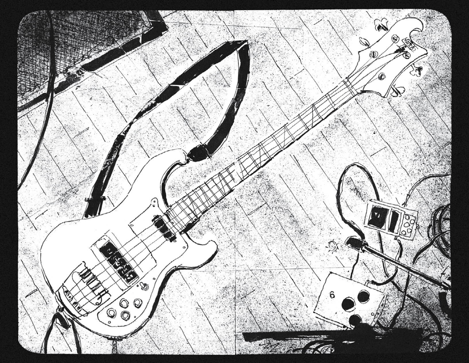
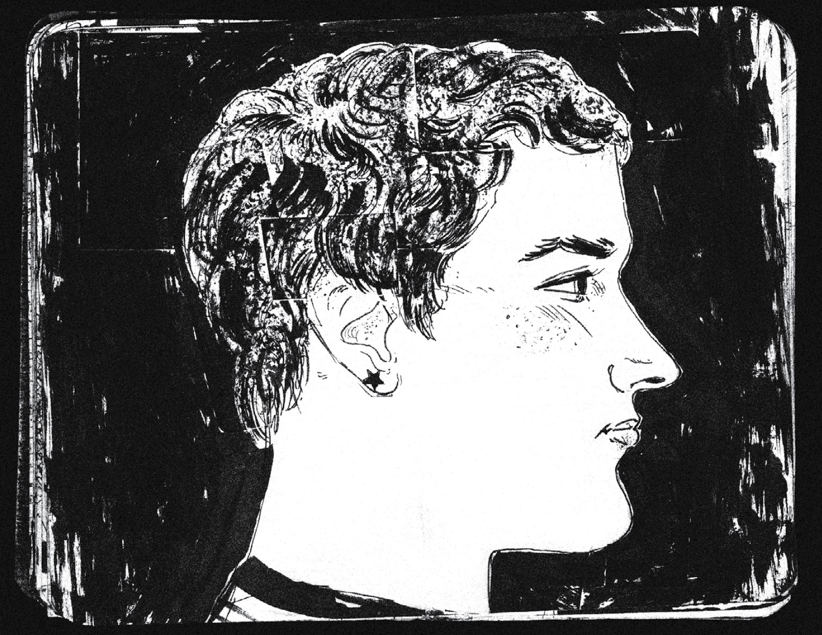
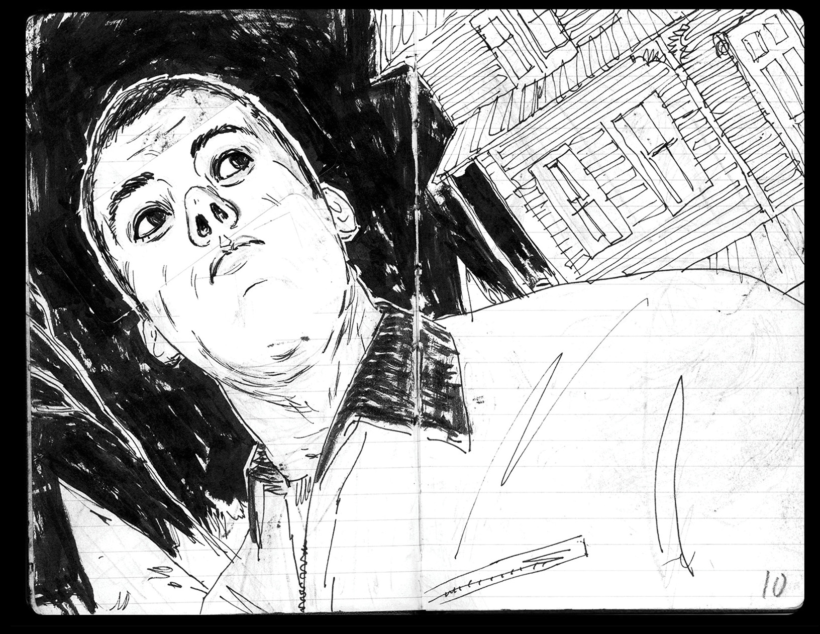
Every campaign in this portfolio started somewhere analog. Ink on paper, no undo button, no client feedback. Drawing is where I pressure-test ideas before they become pixels — and where I remember why I got into this in the first place.
I keep pocket journals scattered everywhere — one in my jacket, a stack on my desk, a few stashed in random corners of the house. Moleskines, Field Notes, Leuchtturm1917s, random corporate swag journals. Whatever I can get my hands on.
Working with ink keeps me grounded, especially after long stretches staring at screens. Drawing reminds me what it is to be human: the importance of making mistakes, keeping those mistakes, and working with them — instead of hitting undo or starting over. To make a mark I can't erase. To get ink under my fingernails.